
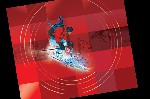
 When Recipe for Men launched in the United States this is the booklet they used to explain the origin, ingredients and value of their products.
 We chose to use vibrant colors and images for the booklet to ensure it would get attention and be remembered.
 To give the booklet added interest and to encourage people to keep it around I gathered a list of skin quotes from which Recipe for Men selected a quote for each of the spreads.
 Ad for Cosmopolitan Magazine and a couple of banner ads.
 This folder contains the Recipe for Men Sales Sheet and Training Manual.
 HIP stands for historical and interesting places. The HIP District is the area running along the South coastline of Laguna Beach. It is home to businesses, historic buildings and art works. The HIP Map/Directory is a multi-folded directory that is placed in hotel lobbies and information booths around Laguna Beach.


 This is another branding project I worked with Ellen Looyen Communications. Mary gently sheds light on peoples lives to help them turn disorganizated lives into well organized ones.
 The client had 20 pages of information that they wanted condensed to fit into an 8 page brochure. Careful analysis revealed that in those 20 pages there were just six parts to the Fearless Feedback system, a great deal of supporting material and data, plus some repitition of ideas.
  This is the home page for the Fearless Feedback client who returned to have a website designed.
 Clark County puts on a Fair and Rodeo every April. For this they require posters and billboards.


 Because JLM is a financial institution this brochure needed to have a clean, uncluttered look. The logo determined the color and I added it's complimentary color to the headlines.
 This brochure was all about the fabrics that SHM manufactured and sold.
 The Floral Creations brochure was all about the flower arrangements. Their logo became the inspiration for the pattern in the background and the ribbons surrounding the arrangements.
 Floral Creations asked for a gate fold brochure and this is the gate that is displayed when you open the brochure cover.
 Green Forest Temple is a studio that teaches Kung Fu. The owner and teacher gave me the handlettered Chinese charaters for the logo which I then reproduced in PhotoShop.
 These monthly newsletters were published by Jon to provide tips on SEO for his subscribers.
 Jon is a marketing and SEO guru.
 This was a lot of fun because the Sensational Kids client wanted the brochure to use colors and images similar to the images they had on their website. I got to draw butterflys and rainbows, and play with primary colors.
 This and the following images were my "play" in PhotoShop. I photgraphed this character at a Latin Jazz Festival in Chicago's Millenium Park and decided that I wanted to place it in a new environment.
 Since I do a lot of work for a men's skin care company I had some fun creating this image for rough, dry skin.
 I had taken a photgraph of this little boy standing on top of a brick wall and decided to put him on a brick edifice that was a little higher.
 I enjoy creating images that are their words.
 1
1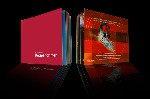 2
2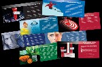 3
3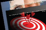 4
4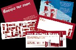 5
5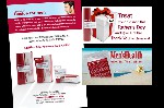 6
6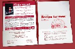 7
7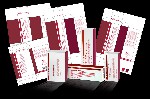 8
8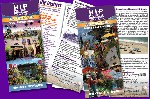 9
9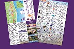 10
10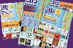 11
11 12
12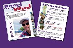 13
13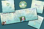 17
17 18
18 19
19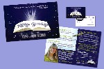 20
20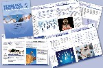 21
21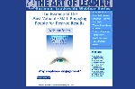 22
22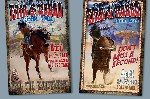 23
23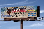 24
24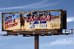 25
25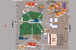 26
26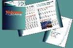 27
27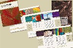 28
28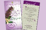 29
29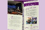 30
30 31
31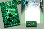 32
32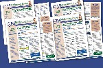 33
33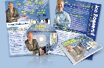 34
34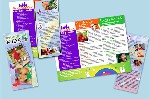 35
35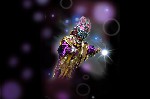 36
36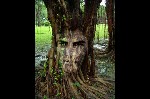 37
37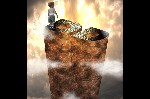 38
38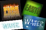 39
39